Midsumma Brand Identity
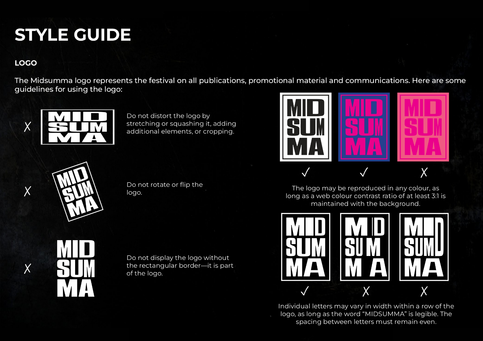
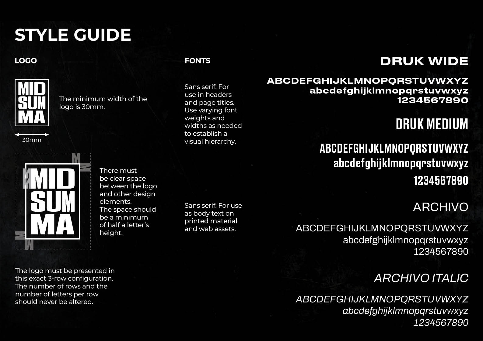
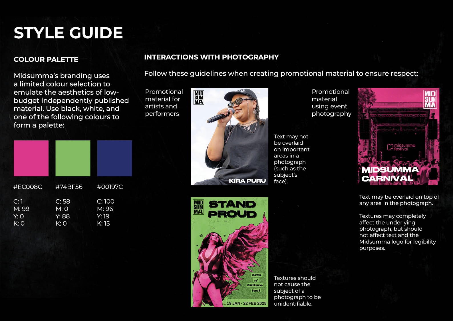
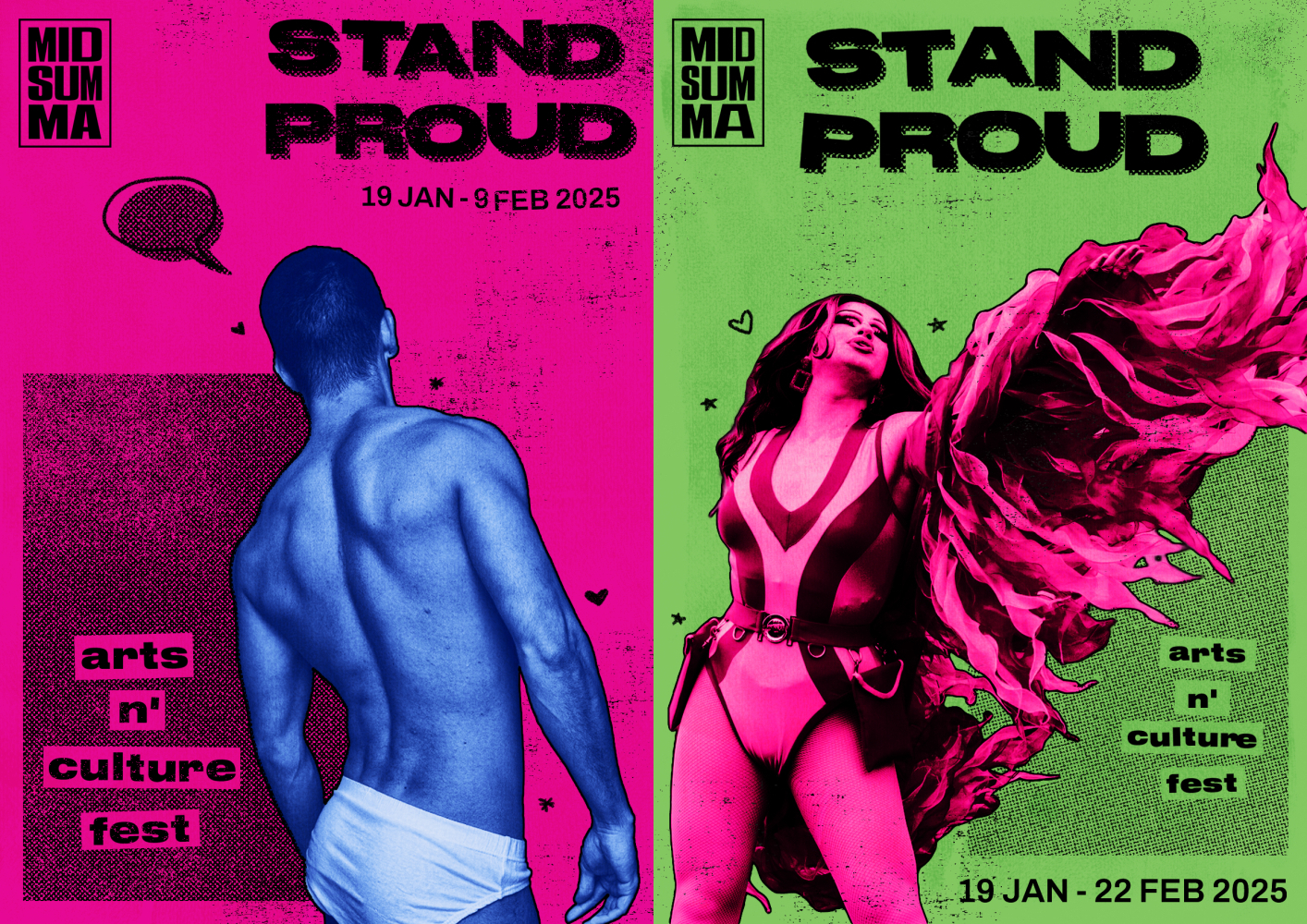
Midsumma is one of Australia's largest Pride festivals, hosted annually in locations across Victoria. This rebrand features an eyecatching identity that emphasizes the festival's commitment to platforming marginalised artists. Drawing inspiration from underground zine culture of the 1980s and 1990s, the rebrand moves away from a minimalist look to a bolder identity that embraces diversity and imperfection.
Timeframe: 4 weeks
Tools used: Adobe Illustrator, Adobe Photoshop, Adobe InDesign
Skills: Graphic Design, Branding